- Published on
Angular animations - Fade In and Fade Out
- Authors

- Name
- Keith Dechant
Angular's animation API is quite powerful. It can trigger various special effects when data changes or when an element is added or removed. The effects on adding and removing were useful to me in a recent project, so I thought I would take a closer look.
As a demonstration of the animations API, I will show how to make elements fade in when they are added and fade out when they are removed. This is done using an opacity styles and some standard browser animations.
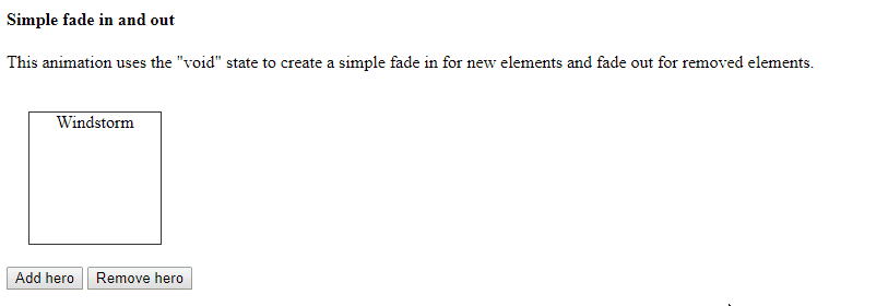
Here's what the finished product will look like:
Try this at home!
This demo is based on the Tour of Heroes application from the official Angular documentation. A familiarity with that documentation would be helpful here, but not required.
You can download the finished demo application source code on GitHub.
Getting started
First, we need an Angular service, component, and some CSS.
The Hero service is loosely based on the one from the Angular documentation:
hero.service.ts:
import { Injectable } from '@angular/core';

export class Hero {
  constructor(public name: string) { }
}

const ALL_HEROES = [
  'Windstorm',
  'RubberMan',
  'Bombasto',
  'Magneta',
  'Dynama',
  'Narco',
  'Celeritas',
  'Dr IQ',
  'Magma',
  'Tornado'
].map(name => new Hero(name));

@Injectable()
export class HeroService {

  heroes: Hero[] = [];

  canAdd() {
    return this.heroes.length < ALL_HEROES.length;
  }

  canRemove() {
    return this.heroes.length > 0;
  }

  add(active = true) {
    let hero = ALL_HEROES[this.heroes.length];
    this.heroes.push(hero);
  }

  remove() {
    this.heroes.length -= 1;
  }

}
This service contains the logic for adding and removing a hero, and it doesn't do much more. None of the animation code is contained in the service.
Our CSS is quite simple. It just renders the hero elements in floating boxes with a border:
list.component.css:
.list-container {
  width: 100%;
  float: left;
}

.list-item {
  border: 1px solid #333;
  position: relative;
  margin: 20px;
  width: 120px;
  height: 120px;
  text-align: center;
  float: left;
}
Note that we don't need to add any of the styles like opacity to the CSS itself. These are all managed by Angular. In the CSS, we only need to write the rules that don't change during the animation.
In this case, the border, div shape, and float don't change during the animation, so we keep them in the CSS. But, we could change these too, if we wanted. Angular lets you change nearly anything you can affect with an inline style.
Our main app component is fairly simple, mostly just a container for everything:
import { Component } from '@angular/core';

import { Hero, HeroService } from './hero.service';

@Component({
  selector: 'app-root',
  template: `
  <h4>Simple fade in and out</h4>
  <app-list-simple-fade [heroes]="heroes"></app-list-simple-fade>
  `,
  providers: [HeroService]
})
export class AppComponent {
  title = 'Angular Animations Demo';
  heroes: Hero[];

  constructor(private heroService: HeroService) {
    this.heroes = heroService.heroes;
  }
}
Setting up animations in the component
The list component is where the fun begins:
list-simple-fade.component.ts:
@Component({
  selector: 'app-list-simple-fade',
  template: `
    <div class="list-container">
      <div class="list-item" *ngFor="let hero of heroes"
        [@simpleFadeAnimation]="'in'">
        {{ hero.name }}
      </div>
    </div>
  `,
  styleUrls: ['./list.component.css'],
  animations: [
    // the fade-in/fade-out animation.
    trigger('simpleFadeAnimation', [

      // the "in" style determines the "resting" state of the element when it is visible.
      state('in', style({opacity: 1})),

      // fade in when created. this could also be written as transition('void => *')
      transition(':enter', [
        style({opacity: 0}),
        animate(600 )
      ]),

      // fade out when destroyed. this could also be written as transition('void => *')
      transition(':leave',
        animate(600, style({opacity: 0})))
    ])
  ]
})
export class ListSimpleFadeComponent {
   @Input() heroes: Hero[];
}
The template here is very simple, just a couple elements. Note the [@simpleFadeAnimation]="'in'" attribute on the "list-item" div. This is how we bind animations to the element.
In our "animations" section below, we see the actual definition of the animations. Note that the trigger name 'simpleFadeAnimation' matches the name we provided in the template.
Here there are a few fundamental concepts:
States
A "state" refers to the condition of the element at rest, when no animation is happening. Animations always begin and end at a state.
Here, the following code for the "in" state defines that the element should have an opacity of 1:
state('in', style({opacity: 1})),
There is another hidden state in use here as well. It's called "void" and it refers to the lack of an element. Our hero list items will have one of two states: "void" and "in".
Other types of animations might use multiple states like "active" and "inactive" and transition between them. The (official documentation)[https://angular.io/guide/animations] shows many examples of this.
Transitions
A "transition" refers to the motion part of the animation. Transitions define which effects to use when transitioning from one state to another.
When a new element is added to the list, it triggers the "void => *" transition, which has a shorthand notation, ":enter":
transition(':enter', [
  style({opacity: 0}),
  animate(600 )
]),
The :enter transition requires two separate parts:
- The first element in the array defines the initial state, which is what the element looks like the moment it appears on screen. Here, we're using
style({opacity: 0})to make the element invisible when it first appears in the DOM. - The second element defines the type of animation to use as the element transitions from the initial state to its final resting place (the "in" state described above.)
So, this transition does the following:
- Add the element to the dom and immediately give it an opacity of zero
- Fade in by adjusting the opacity toward 1 (the value from the "in" state) over a period of 600 milliseconds.
When an element is removed from the list, Angular triggers the "* => void" transition, which has a shorthand notation of ":leave":
transition(':leave',
  animate(600, style({opacity: 0})))
Notice that the syntax here is different than the syntax of the ":enter" transition. This is because the effects are defined in reverse order.
Here, we transition from the "in" state (opacity: 1), over 600 ms, toward the leaving state (opacity: 0). At the moment the transition finishes, Angular removes the element from the DOM.
Conclusion
That's it for the first Angular animation example. Remember to (download the source code on GitHub)[https://github.com/kdechant/angular-animations-demo] and try it yourself. And look for a more sophisticated example in a future demo, coming soon.
Happy coding!